3.
B.U. Gastronomy Branding
Branding
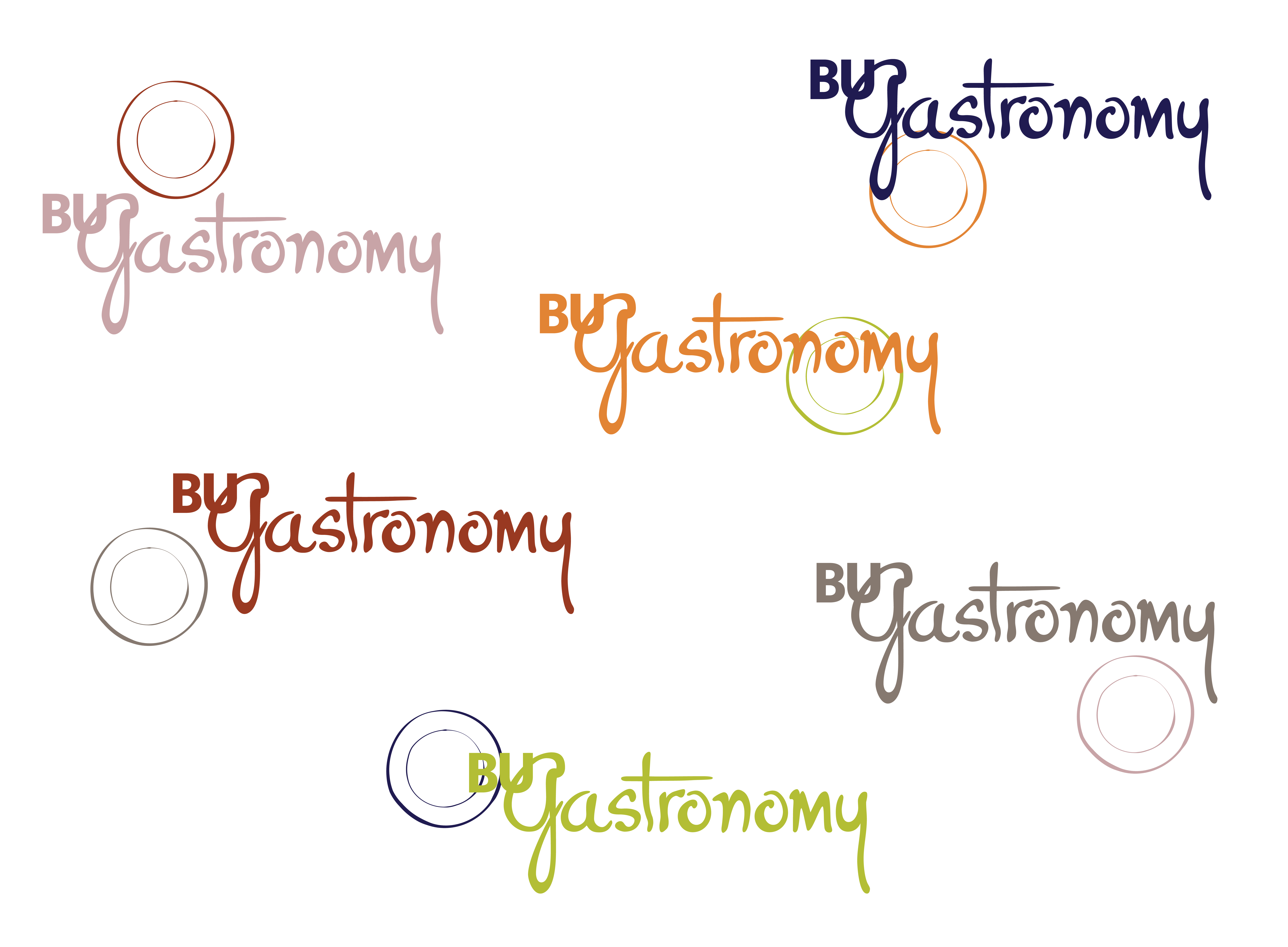
During the Spring 2020 semester, I worked on a team to create a visual identity and branding system for the Boston University's Metropolitan College's Gastronomy Program. Program directors and students were having a difficult time explaining what gastronomy is, and needed a visual system that would better communicate the concept. The overarching theme for this system was the idea that gastronomy is the study of Food And [blank]. Food and culture, food and entertainment, food and senses, etc. The idea of the plate was introduced at the very beginning to convey this concept. We used the traditional Boston University typeface, Whitney, in conjunction with P22 Hopper - Josephine. The program was founded by Jacques Pepin and Julia Child. We wanted to hold on to a bit of that history with a hand drawn typeface, similar to the Pepin's handwriting on his hand drawn menus. We picked an earthy color palette, to speak to how the program really gets to the roots of "Food And". The toolkit we handed over to the client showed how this system could be played out over print and digital media, call-outs, and products. Collaborators: Anissa Martinez, Sohini Mukherjee, Mahnoor Butt, Ciaran Brandin, Yuanwei Xu, and Kun Zheng |

